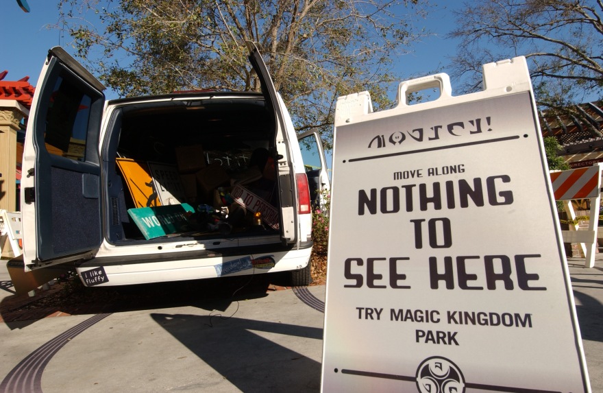
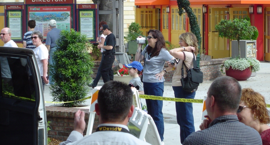
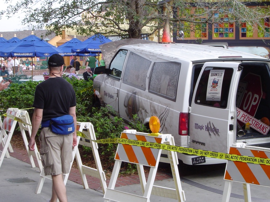
Star Wars Awakens spot
A new, fun spot my team did advertising all the new Star Wars experiences at Walt Disney World. Awesome work and concept by writer John McCall and Art Director Matt Stewart! We also did a similar version for Disneyland.
Happy Holidays!
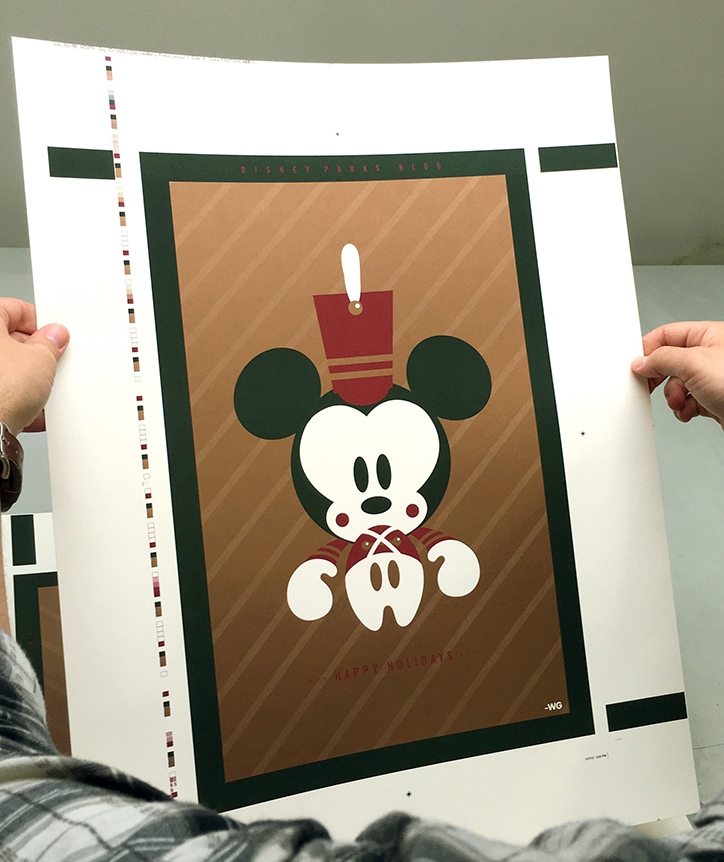
A poster I designed that we had printed for a Disney Parks Blog giveaway. 3 spot colors including metallic bronze on heavy creme stock.
Blast off from Tomorrowland

A mobile and desktop wallpaper image I created for the Disney Parks Blog. You can download it for free on their site.
Star Wars Weekends Billboards


The billboards we did at Yellow Shoes this year for Star Wars Weekends (going on now) The idea is you are As Close to the Force as You Can Get, so even in the billboards we wanted it to seem like the characters are almost between you and the actual billboards. Art Director: Matt Stewart Character art by Meduza Arts.
As Close To The Force As You Can Get posters


Star Wars Weekends posters Art directed by Matt Stewart with some great lines by John McCall. This amazingly detailed character art was built from scratch in CGI by Meduzarts in Montreal. The team wanted to communicate the idea that at Star Wars Weekends you are literally As Close To the Force As You Can Get.
Happy Star Wars Day!

May the 4th Be With You.
New spot: Star Wars Weekends
One of my favorite Disney commercials we have done at Yellow Shoes to date! We just finished this spot for this year’s Star Wars Weekends at Disney’s Hollywoood Studios. It was awesome once again to team up with some Jedi Creative Masters, John McCall and Matt Stewart, they have been doing some killer work for Star Wars Weekends for years. And once again this year they knock it out of the park! It was directed by David Mellor at Framestore and our DP was the amazing Larry Fong with special effects by Framestore as well. I hope you enjoy as much as we did making it.
New Flower and Garden spot we did
Fun animated fly through to showcase the topiaries but also the addition of food this year at the festival. John McCall and Laura Adams were the team on this one and did an awesome job bringing it to life with the animation help of Mirada studios. Enjoy and see you there!
1960’s inspired fake business cards for a real Job


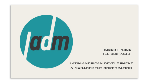
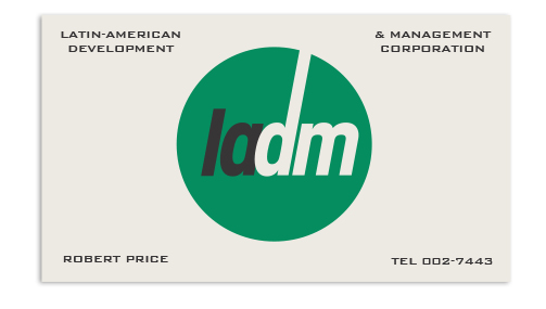


This was a fun project that came across my desk recently. Design some 1960’s inspired business cards for fake Disney companies. The 60’s is also one of my favorite periods of graphic design as well. I drew a lot of inspiration by looking at Scandanavian design from the 60’s, there was some really great stuff there. Also, google some of the people and addresses I used on the cards for a little Disney history that might be appropriate for this project. A few of these cards will be used in an upcoming magazine article which will include other “fake” cards from other designers here at Yellow Shoes as well.
